


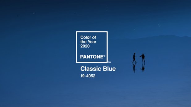
5 Dec 2019. The company Pantone announced the color of the year — classic blue PANTONE 19-4052. And perhaps for the first time in the entire history of observations it is remarkably synchronous with the color innovations of paint brands.
What does this mean in practice? In 2020 variations of blue are not just a forecast (which is also realize how to apply in the interior), and a really common color. Your attention shades of blue and companion from respected brands whose products are sold in Russia.
1. PANTONE
The American color Institute
Color 2020: “Sky at dusk” PANTONE Classic Blue 19-4052.
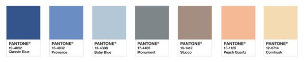
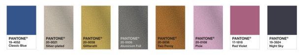
This is the twentieth time, when a company announces color of the year. Interestingly, in 2000, the color of the year was also named a shade of blue PANTONE 15-4020 Cerulean. Pantone Color Institute releases recommendations for the colors at the same time for the fashion industry, beauty, interior and graphic design, food. That is, with high probability a blue hue in the coming year will appear in advertising, packaging design, etc.
What was the inspiration: “This great blue color is reminiscent of the infinite evening sky. 19-4052 PANTONE Classic Blue encourages us to look beyond the boundaries of the obvious, to think deeper and expand horizons,” says Leatrice Eiseman, Executive Director of the Pantone Color Institute.
Examples of color combinations below shows the recommended combination with pure hues and glitter (sparkles).
How to use: the fan Pantone universal and used worldwide. For example, if you tintable paint the hardware or make custom furniture in one country and discharged from the other tiles in the tone of painted walls — knowledge of the “number” of colors will help to get into the shade.
For interior designers, Pantone has prepared a limited edition anniversary guide — Pantone Color of the Year 2020 Home + Interiors Color Guides (guide on color use 2020 interior design). Tour guide — $210, you can order on the official website.
Manders
2. DESIGNERS GUILD
British paint brand
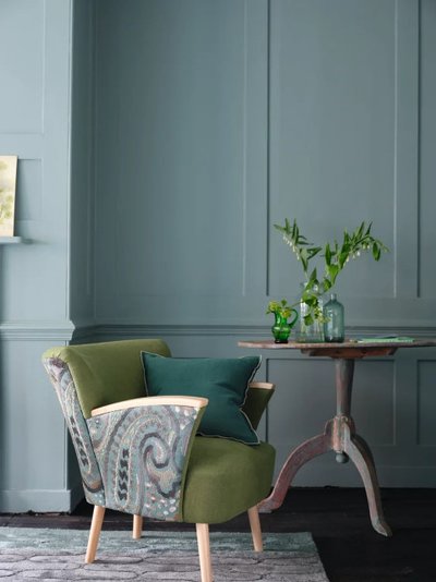
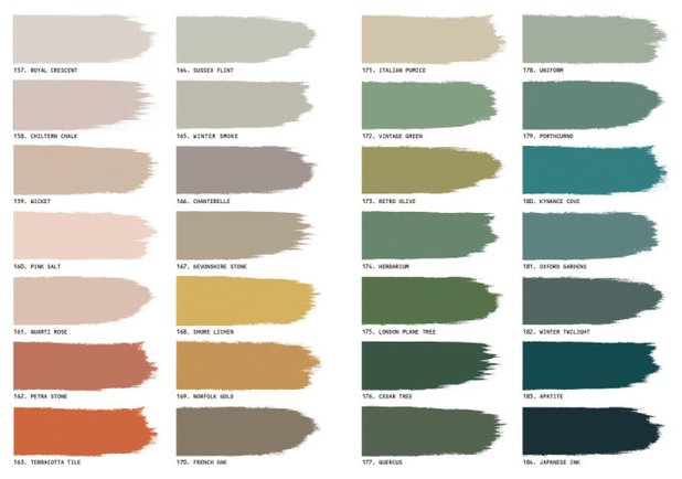
The 2020 palette — 28 shades of natural Earth Tones palette. Interestingly, the presentation of a palette of 28 November 2019 even earlier than in the UK (there is an official release scheduled for January).
The photo is a shade of 181 Oxford Garden
Manders
Manders
What was the inspiration: nature, hints of minerals, forests, plants. The interiors will be well combined with natural materials: wood, stone, metal, glass.
Manders
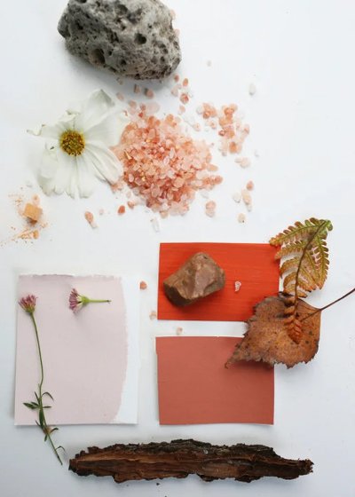
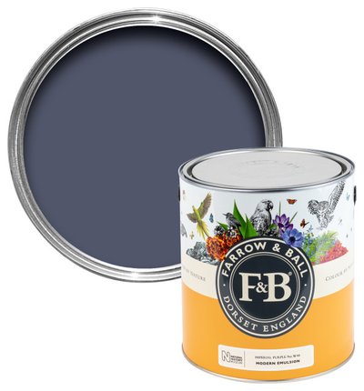
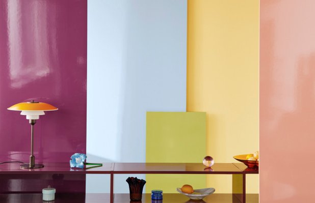
3. FARROW AND BALL
British paint brand
Palette 2020 — 16 new shades of natural colors. Paint developed jointly with the British Museum of natural history.
Manders
What was the inspiration: all the shades are taken from records in the historical book “Werner”s Nomenclature of Colours”, first published in 1814. This is a completely unique book — figuratively speaking, Pantone nineteenth century. The book was the official classification of the color in nature at a time when no photos, to make such classification did not exist.
“It’s not just colors, inspired by nature, the colors of nature, meticulously observed, captured and reproduced with great care,” says Charlotte Cosby, head of creative Department at Farrow & Ball.
Farrow & Ball
Imperial Purple No.W40
MORE PHOTOS…
Folder with official interior shot plus bonus footage of the presentation of the collection of Farrow& Ball at the Museum of Natural history
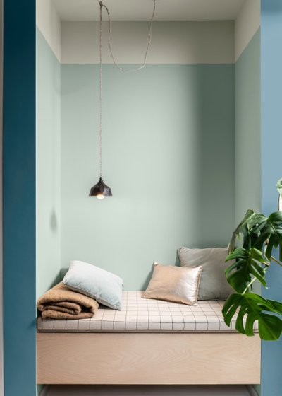
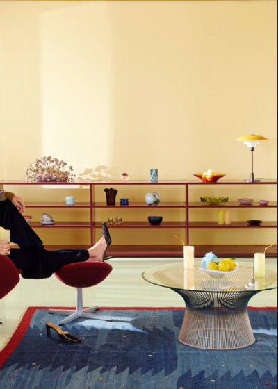
Dulux
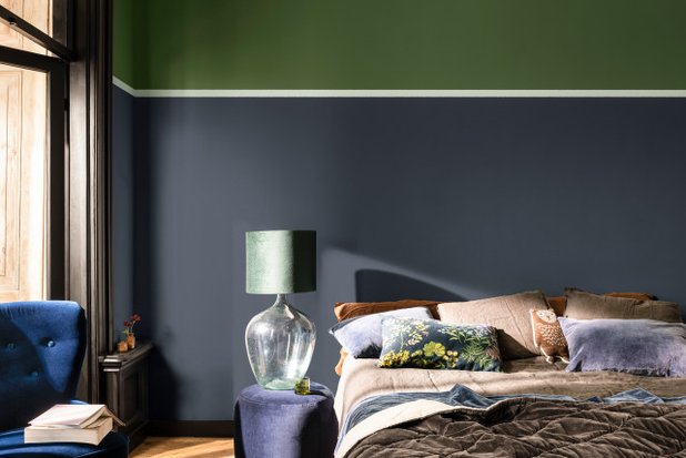
4. DULUX
British paint brand
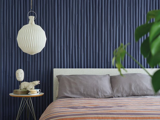
The color of the year 2020 — “Quiet (quiet) dawn” Tranquil dawn. We would call it mint or color of moss-sphagnum. In the interior in the photo above he used a strip that separates the green and blueberry fragments of the wall. Tranquil Dawn was included in all four palettes from Dulux ColourFutures 2020.
Dulux
What was the inspiration: Tranquil dawn reminiscent of the colors of the morning sky and embodies our desire to preserve the human qualities that we need in the new decade,” explains Helen van Gent, head of the International AkzoNobel aesthetic center (conducts the annual study of color trends, which then produces Dulux paint).
MORE PHOTOS…
Official shooting color 2020 Dulux examples of interiors are
Alcro
5. ALCRO
Swedish paint brand
Palette 2020: creative Director of the brand Yvonne Carlson chose 20 timeless shades from the palette of the brand as the colors of 2020. This all — natural tones and muted colors. The company itself calls them “Nordic pastel”.
Alcro
What was the inspiration: the trend to eco-mindedness, which is very susceptible to the Scandinavian countries. At all the Northern shows of the design refers to the fact that it is time to stop the overconsumption. The power of good design is in its universality, timelessness, ability to serve many generations.
6. TIKKURILA
Finnish paint brand
Color 2020 — “Lemonade” H300. Color collection Tikkurila Color Now 2020 developed in collaboration with designer Duo Joslin-Maunula (Juslin-Maunula).
What was the inspiration: the saying “If fate hands you a lemon, make lemonade”.
ON THE SUBJECT…
Read more about shades collection 2020 from Tikkurila
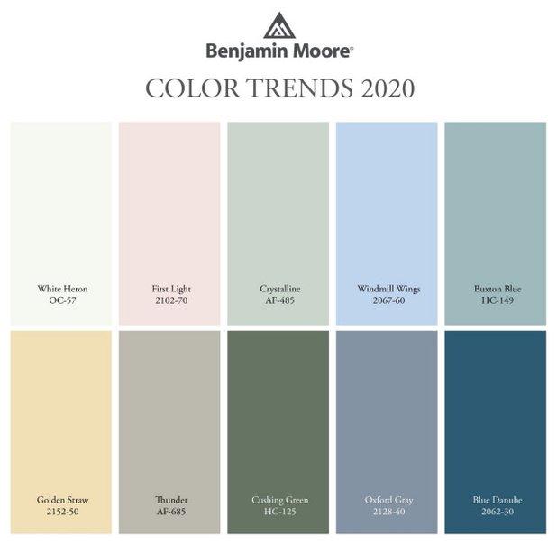
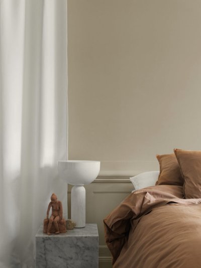
7. BENJAMINE MOORE
American paint brand
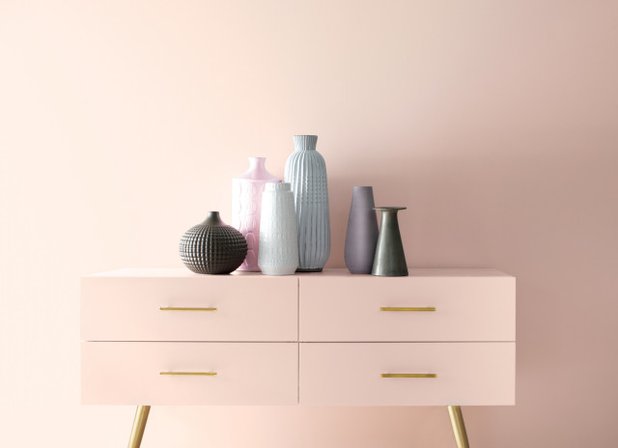
Palette 2020 — 10 pastel shades. Flagship announced pink ‘First light’ — First Light 2102.
“It will be a new decade, and for us it was an important moment to do something interesting, says Hannah Yeo (Yeo Hannah), Manager of color and design at Benjamin Moore & Co.
Benjamin Moore
What was the inspiration: shades were selected according to several principles. They are self contained, unobtrusive and combined with each other in any proportions.
ON THE SUBJECT…
Read more about shades collection 2020 from Benjamin Moore
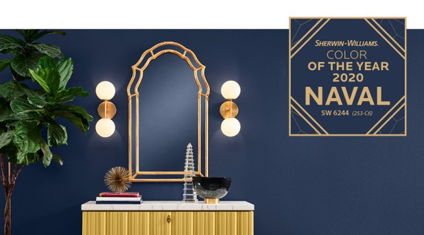
8. SHARVIN-WILLIAMS
American paint brand
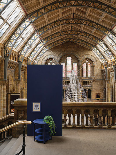
Color 2020 — a dark blue or a shade of sea officers: Naval SW 6244.
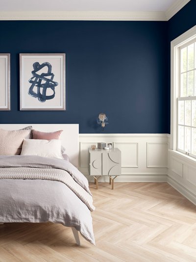
What was the inspiration: the night sky. “Using color in interior design is changing. It’s not just about how a space looks, but how it makes you feel, explains sue Wadden, Director of marketing for Sherwin-Williams. — People want to feel physically and emotionally safe. Our blue resembles the color of the night sky, which people for centuries have asked for help”.
ON THE SUBJECT…
Read more about shades collection 2020 from Sherwin-Williams
IT’S YOUR TURN…
Some of the color forecasts for the year 2020 for you? What colors you plan to use in interiors — share in the comments


