


Among the top 10 most saved photos on Houzz in Britain — five interior was suddenly the same color. Our colleagues have identified it as a “Danish” [eng.] It’s somewhere between covered with turquoise, Tiffany and darkened the color of the eucalyptus leaf. What it goes best how to use it in interiors?
► Reminder: to get more information about the project, see all the angles of shooting or ask a question personally to the designer of the project — click on any photo
Design Circus
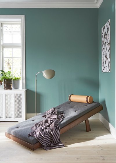
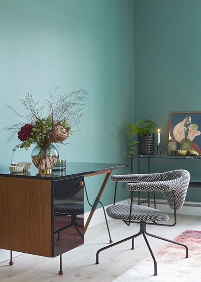
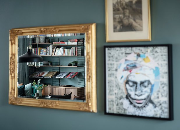
1. Serenity
The authors of the project: Design Circus
Where: Copenhagen, Denmark
How used: the background color for the walls
Color scheme: Danish blue plus light wood, white, beige, umber and gray
___________________________________
ON THE SUBJECT…
The Colour Picker function: Determine what shade in the photo
___________________________________
The Sweet Spot
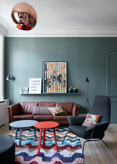
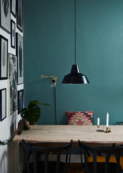
2. A vibrant mix
The authors of the project: The Sweet Spot
Where: Copenhagen, Denmark
How used: the background color for the walls
Color scheme: Danish blue plus wine brown, blue, dark blue, scarlet
___________________________
The Sweet Spot
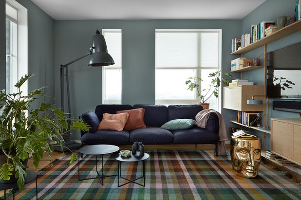
3. A classic of the genre
The authors of the project: The Sweet Spot
Where: Copenhagen, Denmark
How used: the background color for the walls
Color scheme: Danish blue plus inky purple, green, shades of terracotta, bronze, graphite (lamp)
___________________________
SYNESTHESIES
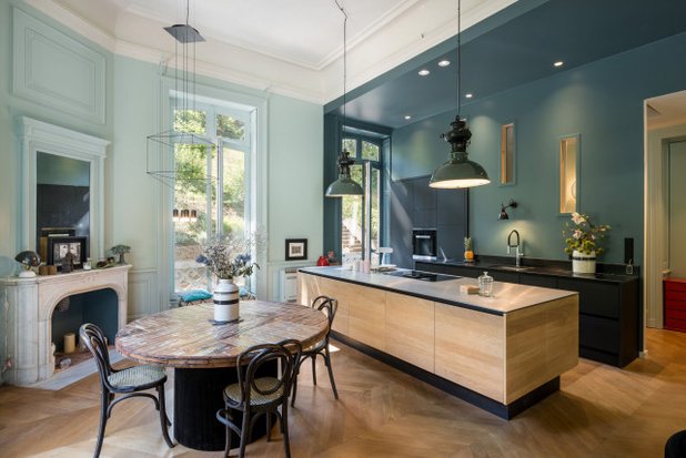
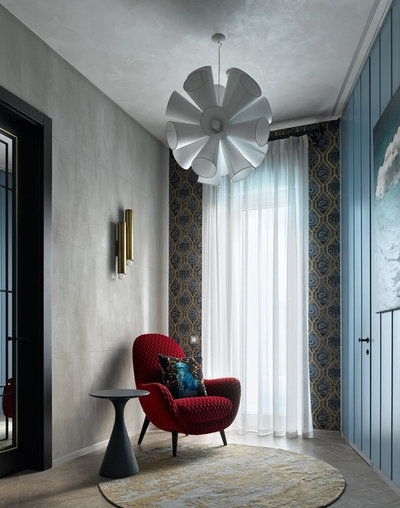
4. Color-blocks
Authors: SYNESTHESIES
Where: Lyon, France
How used: the background color for the walls
Color scheme: Danish blue plus the same shade in rabble; light wood and black accents
___________________________
Paint µa
5. Shanghai Express
The author of the project: designer Natalia pantyukhina, “Group Geometer”
Photo: Sergey Ananiev.
Where: Moscow, Russia
How used: accent wall painted in one tone with frameless door
Color scheme: Danish blue plus Bordeaux and shades of gray
___________________________
Diespeker Terrazzo & Marble
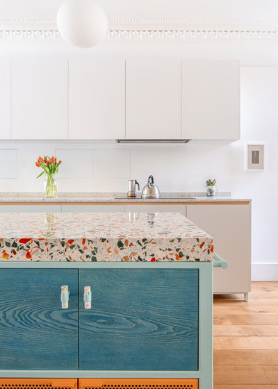
6. Fashionable, bright, youth
Authors: Diespeker Terrazzo & Marble
Where: London, Britain
How used: kitchen facade
Color scheme: Danish blue in a translucent coloring of the tree plus orange and colorful terrazzo
___________________________
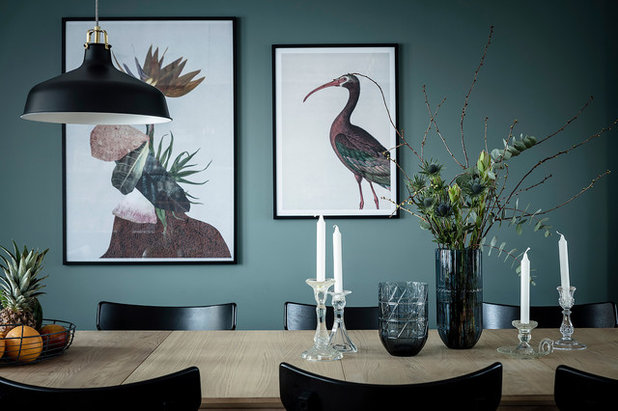
Design Circus
7. Candlelight
The authors of the project: Design Circus
Where: Copenhagen, Denmark
How used: the background color for the walls
Color scheme: Danish blue plus black lacquered glass, black metal frames of the furniture, gray and red tree. Note denaturirovannogo wood flooring — a white maple gradually coming back into fashion
___________________________
Mia Mortensen Photography
8. Rough background
Photo: Mia Mortensen Photography
Where: Wilshire, Denmark
How used: accent wall in kitchen-dining room (the “working” and potentially “setrawdata” behind the bench of the dining table)
Color scheme: Danish blue plus black and shades of pink. Note the pronounced texture painted walls
___________________________
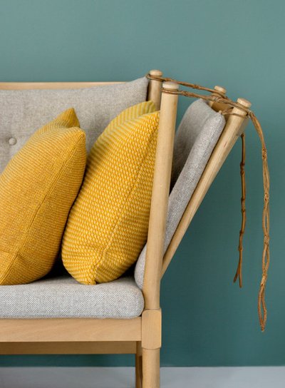
KML Design
9. Advertising photography of furniture
Project author: Kira Brandt from KML Design
Where: Denmark
How used: the background color for “back” in the frame
Color scheme: Danish blue plus mustard and light grey. Pay attention to the texture of the pillows in similar colors — boucle and felt. The interiors are fashionable to build on the combination of textures
___________________________
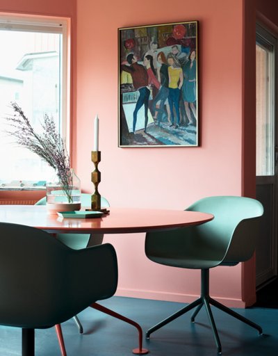
Residence
10. Pink mood
The author of the project: Residence
Where: Stockholm, Sweden
How used: the color of the floor covering
Color scheme: Danish blue plus in the company of pink and grey-emerald
___________________________
Alcro
11. In the heart of Miami beach
Where: Stockholm, Sweden
How used: the shade upholstery. Photography is stylized with paint manufacturer Alcro
Color scheme: here the Danish blue — on the Mat. Perfectly combined with a rich purple, the shades of emerald in rabble and pink. Explosive color scheme
___________________________
Set Visions Ltd
12. Change the proportions of the colours
Authors: Set Visions Ltd, advertising Agency
Where: West Yorkshire, UK
How used: dot accents, color-companion in advertising photography
Color scheme: here Danish blue has introduced a pillow and the flower pots. In combination with a rich emerald green, pink and olive works flawlessly
___________________________
Studio A3
13. Scandinavian color
Authors: Studio A3
Where: Gothenburg, Sweden
How used: the background color for the walls
Color scheme: Danish blue plus bronze-brass and dark wood
___________________________
Studio A3
14. Add drama
Authors: Studio A3
Where: Gothenburg, Sweden
How used: the background color for the walls
Color scheme: Danish blue plus black for contrast
___________________________
Pooky Lighting Ltd
15. Fashion staging
Where: London, Britain
How used: the backdrop for the commercial shoot lamps Pooky Lighting Ltd
Color scheme: another example of a combination with brass and black and umber. White marble is a great complement to this set
___________________________
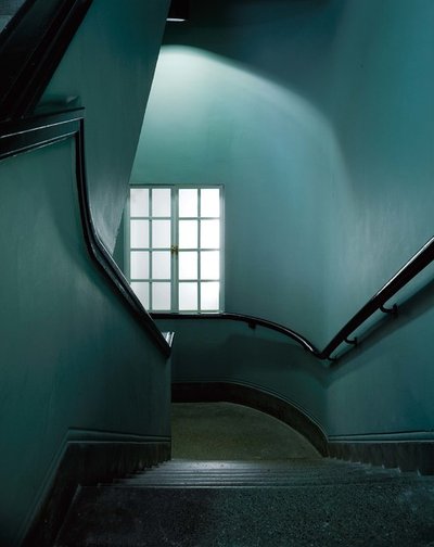
Mark Hines Architects
16. Enveloped
Project author: Mark Hines Architects
Where: London, Britain
How used: the background color for walls, ceiling and even the floor
Color scheme: with myself in shades of different density, for contrast — black handrail and skirting
___________________________


